Project Context
November - January 2024 (6 weeks)
Solo passion project
Tool used: Figma, FigJam, Miro, Notion
My Role
User Research: Competitive Analysis, User Interviews, Persona Mapping, Journey Mapping, Empathy Mapping
UX Design: Storyboarding, Wireframing, Prototyping, Usability Testing
BACKGROUND
Due to my own shopping experience at Citadel Outlets, I was inspired to create this project to help its owner, Craig Realty Group (CRG), solve a serious problem that greatly impacts the retail experience for shoppers and the expansion of its market reach. Wearing the UX designer hat on empowers me to change the world in a positive way.
Craig Realty Group is an industry-leading private developer of upscale factory outlet centers. It owns, operates and manages 15 outlet centers in 8 states across the U.S. You can see the following photo to get the information of center’s locations.
Source: CRG’s official website
THE CHALLENGE
Long checkout queues damage the in-store customer experiences
While shopping at Citadel Outlets, I've observed numerous customers expressing frustration over the lengthy checkout queues. As a fellow customer, I felt exactly what they felt. Outlet Centers are high-traffic areas especially on holidays and weekends, leading to prolonged wait times at checkout. Wait time greatly impact the whole shopping experience. How might we improve the checkout process to elevate customers satisfaction?
Photo taken by me at Nike Factory Store in Citadel Outlets
GOALS
Enable customers to avoid long checkout lines while shopping at Outlet Centers;
Adapt mobile experience into physical store experience and in-person interaction;
For the sake of business growth, it’s imperative to ensure that no customer can leave the store without completing their payment.
the SOLUTION
Mobile self-checkout can help skip the line
White paper RESEARCH
A way to make the checkout faster ……
Starting with white paper research, I began to draw from research articles on the topic of long checkout queues and customer satisfaction - when I stumbled upon an eye-opening finding from Forrester Research and Digimarc:
“Long lines and poor checkout experience are the third highest reason shoppers would go elsewhere - after location and price -cited by 18% of respondents who were asked ‘What factor of the shopping experience would prompt you to shop elsewhere for your groceries?’”
In addition, I was struck by SOTI's Annual Connected Retailer Survey revealing U.S. Consumers prefer speed and convenience when shopping with limited human interaction:
“76% of respondents indicated that retailers that utilize more mobile technology (both self-service and used by sales associates) enable a quicker shopping experience.”
COMPETITIVE ANALYSIS
The competition had no mobile self-checkout function
To learn the ins and outs of of how Craig’s competition works and stay atop of industry trends, I analyzed two competitors who are also outlet-developers in US. My takeaway is that neither of these two featured mobile self-checkout. This then might become an opportunity where I can fill in the gaps.
USER INTERVIEW
To gain an understanding of customers’ preferences, thoughts and feelings, I went to the Citadel Outlets (owned by CRG) in Los Angeles during Christmas, interviewed 5 shoppers and asked them the following questions.
User interview results
Key quotes from interviews
Synthesize the data into an affinity map
Affinity Mapping
THE main insight
Customers are dissatisfied about wasting lots of time for checkout
Based on the affinity map I built to group similar notes under similar headings, I’ve noticed the long line for checkout is a non-negligible cause for customers’ dissatisfaction.
PERSONA
Primary customers intend to buy name-brand products at discounted prices
Based on our insights and observations from the research methods, I built a persona which captures the essence of the major customers and their characteristics. I also formed an empathy map to bridge the understanding of the customers' needs and provide context to a user-centered solution.
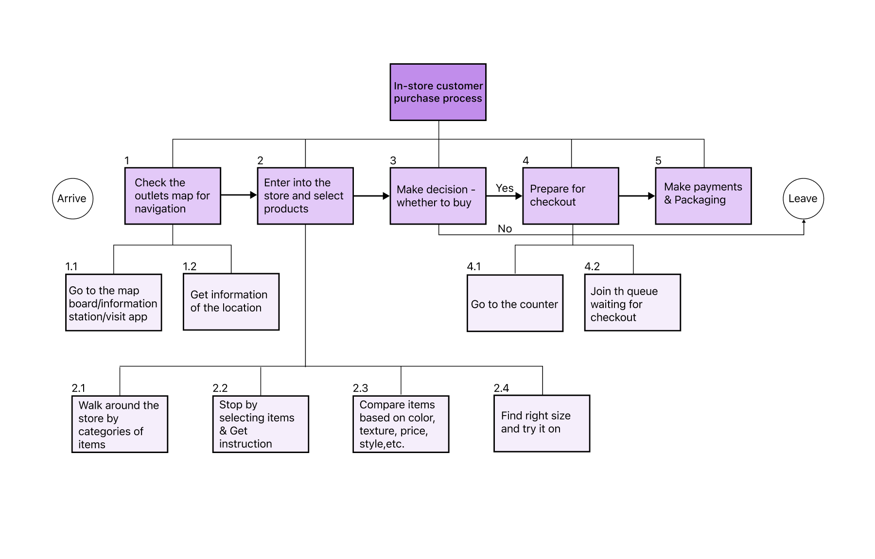
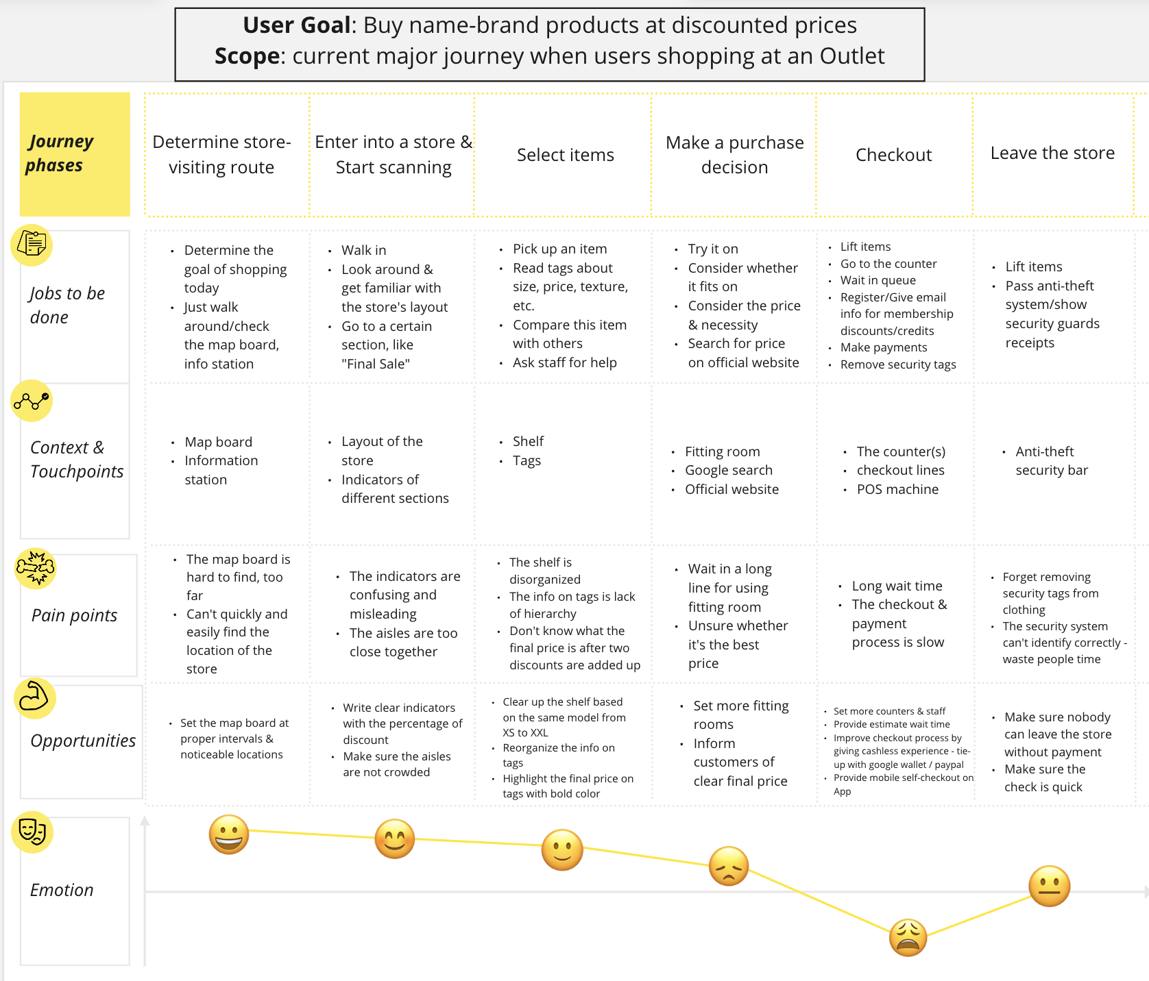
TASK ANALYSIS & JOURNEY MAP
Visualize the process customers go through while shopping in outlet centers
The persona and empathy map helped me outline an hierarchical task analysis, which I then used to craft a journey map enabling me to find opportunities based on customer pain points that are useful for coming up with design solutions.


DESIGN
Narrow down my ideas being brainstormed
To tackle the problem space, I came up with three ideas for stores in outlets: 1) Staff people who go to customers waiting in lines and charge them via the card processor; 2) Inform customers of estimate wait time on an app so that they can decide if they want to come back again; 3) Allow customers at physical stores to perform a mobile self-checkout on an app. Upon thinking about great labor costs to the business, I weeded out the first idea in my mind. To be honest, I was intending to combine the second and third ideas as my final solution to create an app. However, in view of the complexity of designing two new functions and limited time for this project, I decided to just focus on one feature - mobile self-checkout, which is more challenging and appealing to me to do the best.
STORYBOARD
Walk you through Liliana’s journey shopping in a clothing store
The new “Scan and Go” feature is visually illustrated in storyboards, depicting the shopping scenario where the app may be used.
Testing + IMPROVEMENTS
Validate the usability of my low-fi prototype
To measure the discoverability and the fluency of the work flow for the self-checkout feature, I tested my prototype with 5 customers in Citadel Outlets to ask them to finish the following two tasks and recorded their behavior and feedback.
Task 1: Imagine you are at the Nike Factory Store and would like to go to the counter to checkout. However, you see a long queue and you want to do the mobile self-checkout on this app. Try to locate the self-checkout on this app.
Task 2: View your cart and move to checkout.
Quantitative data & key quotes from testing
Three key improvements in my design
Based on the usability testing results and feedback from 4 peers and 1 software engineer, I revised my design to try to do all the heavy lifting for customers. I made three major improvements:
THE FINAL PRODUCT
The final screens
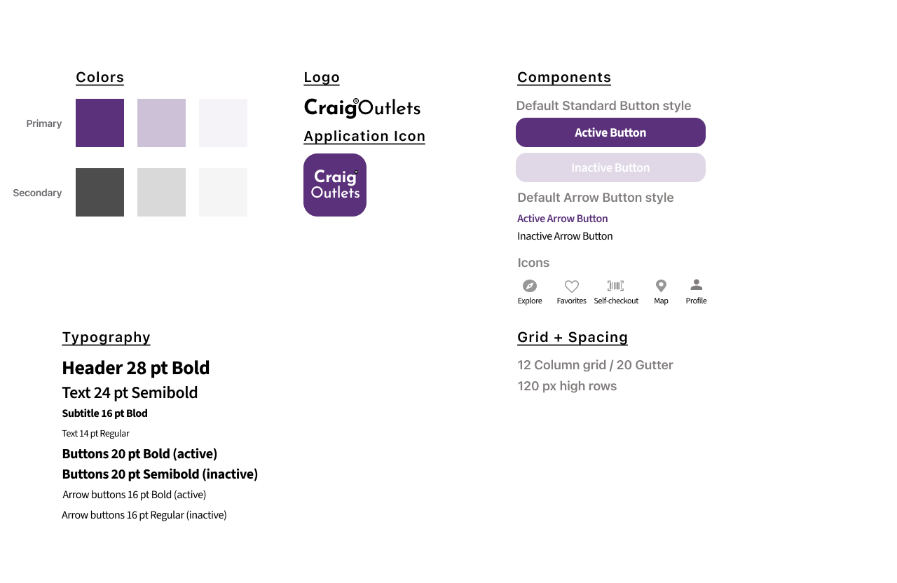
The style guide
Link to my full Figma work file here.
REFLECTIONS + NEXT STEPS
What I’ve learned on my work here
This UX journey has been an incredible adventure so far but I’m lucky to build this project from the ground up with a big impact that I would have ownership of. It deepened my understanding of what value UX can bring into business patterns and impact people’s real life. There are a few things I’ve learned:
Follow the tenet “Identify needs and fill it.” Always ask “WHY” and “How might I …”. This checkout issue occurred in my daily life frequently. Before that, however, I just grumbled it and have never carefully thought about how to change it. To be honest, being a problem-solver instead of accepting the status quo requires great courage, tenacity and creativity.
Spare no effort to do all the heavy lifting for users. As Coco Chanel said, “Simplicity is the keynote of all true elegance.” Remove all unnecessary steps forcing users to take and cluttered content to provide intuitive defaults that respect customers’ time, data and attention.
Incorporate technology while launching physical retail concepts. Although introducing self-checkout technology can be a great way to improve customer experience in brick-and-mortar stores, it’s still not the right fit for every type of store. When doing research in Citadel Outlets, I found self-checkout may not be a good solution for stores like Movado Company Store (watch store) selling high involvement products and requiring significant consideration , or The Luggage Factory, selling products not easy to pick up, scan, and pack.
If I had more time, I would have loved to conduct in-depth ride along usability studies with more customers based on Key Performance Indicators(KPIs) such as time on self-checkout process, user error rates, drop-off rates to measure the usability and viability of my product. Also, another usability testing for the hi-fi prototype can be conducted to compare its results with the low-fi one.
In addition, I’d like to come up with ideas about marketing strategies to increase the number of downloads and daily active users(DAU). This should be accompanied by various promotional materials around physical stores. For instance, the clothes tag can include a sentence informing users they can perform a mobile self-checkout. This can also be included in the signages found throughout stores.
Thanks for reading my case study! 😊
You may also like…
Let’s connect!
© 2023 — Designed by Ningtao Jiang


