Project Context
October - December 2022 (6 weeks)
Client: One Life Counseling Center(Non-profit)
Team Member: Olivia H., Ivy N.
My Role
User Research: User Interviews, Persona
UX Design: Sketches, Wireframing
background
One Life Counseling Center (OLCC) is a non-profit located in San Carlos, California, whose mission is to uplift the well-being of the communities around them through providing mental health counseling for anyone at any cost, mainly including individual or group therapy, education and outreach programs. Suzie H, the Executive Director found me and my team to help better the user experience of its desktop site to enhance its brand awareness. Therefore, I decided to put my UX designer hat on to dive in and see if I could make any improvements to its website.
PROBLEM
The website lacks building brand awareness to its potential audiences
The main problem within this non-profit’s website was first, what does this non-profit do? No any clues in the “above the fold” section which catches visitors’ sight first. These were the overall areas of focus throughout:
Understanding its mission immediately.
Accessing high level user priorities more easily — finding therapists, donating, and supporting.
Providing easy navigation and restructuring content hierarchy.
THE SOLUTION
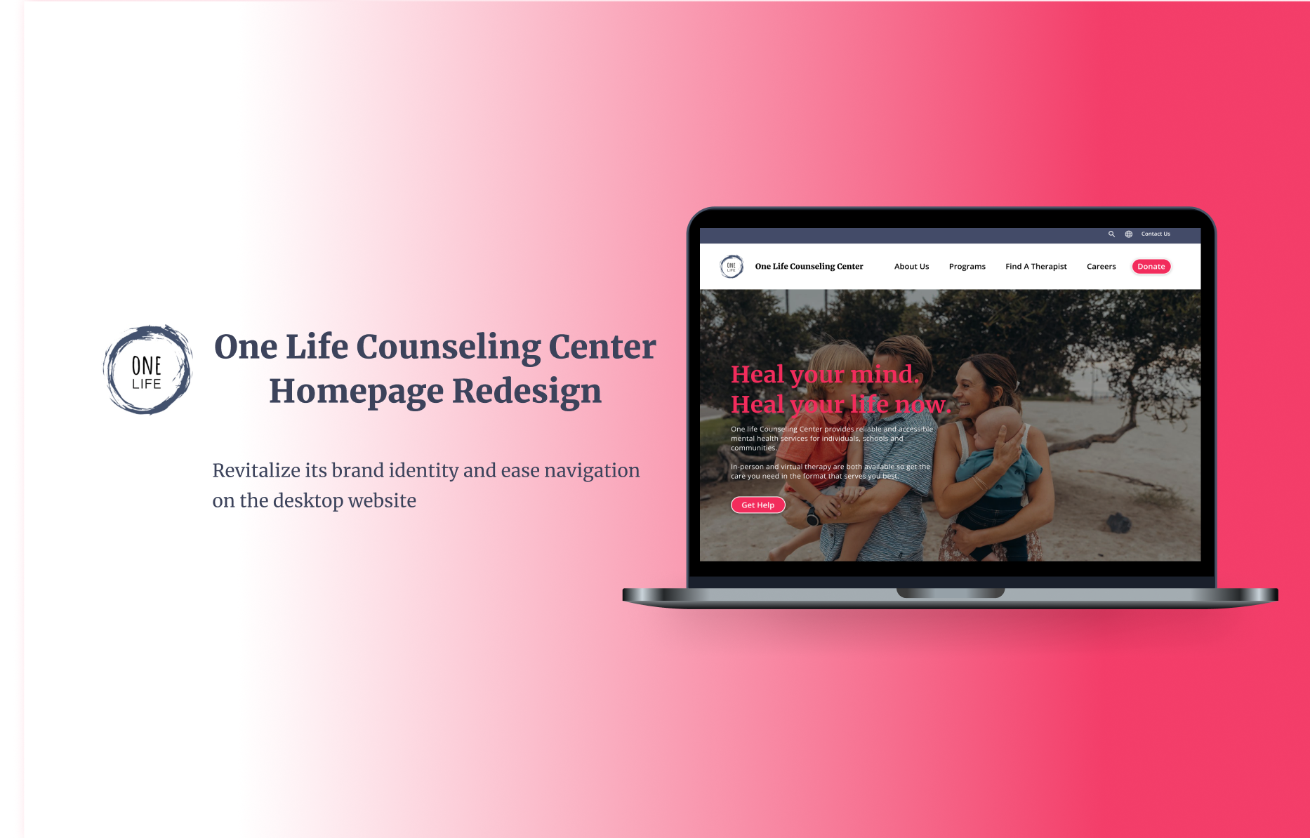
Redesign the homepage to revitalize brand identity and ease navigation
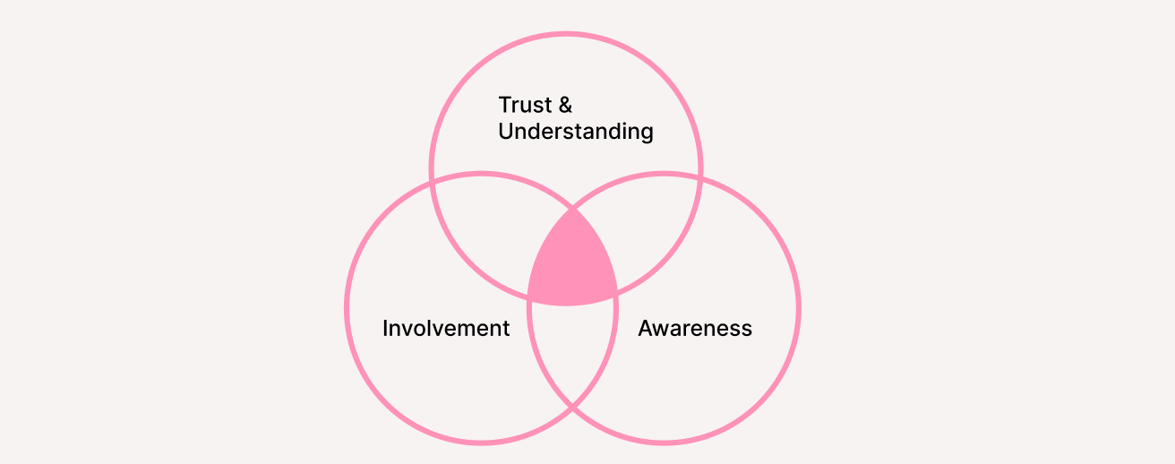
We redesigned the current homepage to provide visitors more intuitive navigation and meaningful information concerning its mission statement, different programs and easy ways to get involved. This would help establish trust and confidence during the user journey, increase brand awareness and ultimately empower people to get involved.
RESEARCH
The user survey reflected it was harder-than-expected to know what the OLCC is
To gain a better understanding of how we could more effectively address the problem, we conducted a series of user interviews and surveys with 10 respondents who haven’t visited the website before and were asked to visit it. Link to see full results here. Questions we asked included:
What is the primary purpose of its non-profit?
Which part(s) of the website inform(s) you of its purpose?
What three words come to your mind when browsing this website?
Are you informed of what actions you can choose to take to get involved?
Identifying the key pain points
Quotes directly from users
COMPARATIVE ANALYSIS
Compare similar sites to form a view of an overall landscape
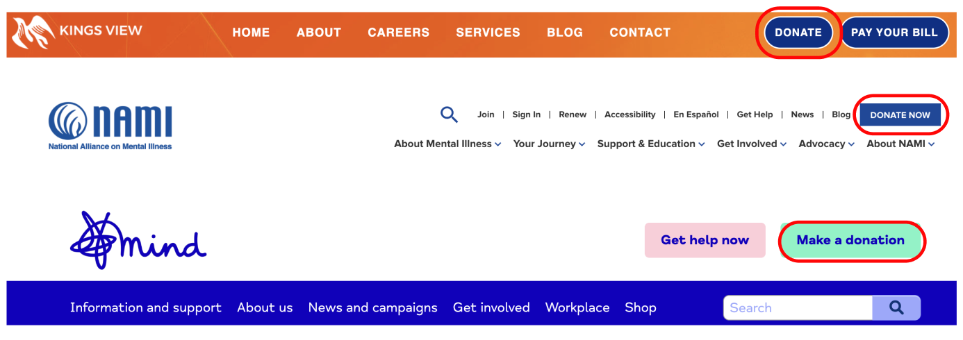
To gain inspiration and identify best practices for redesign, we started to look at a few similar non-profits’ websites concerning mental health, analyzing UI,UX, top navigation, IA and key features. One common feature we identified across these websites was the placement of the donate button in order to emphasize it as the main call to action. This was an important design pattern to consider in order to make it easier and more efficient for users to get involved and donate.
THE MAIN INSIGHT
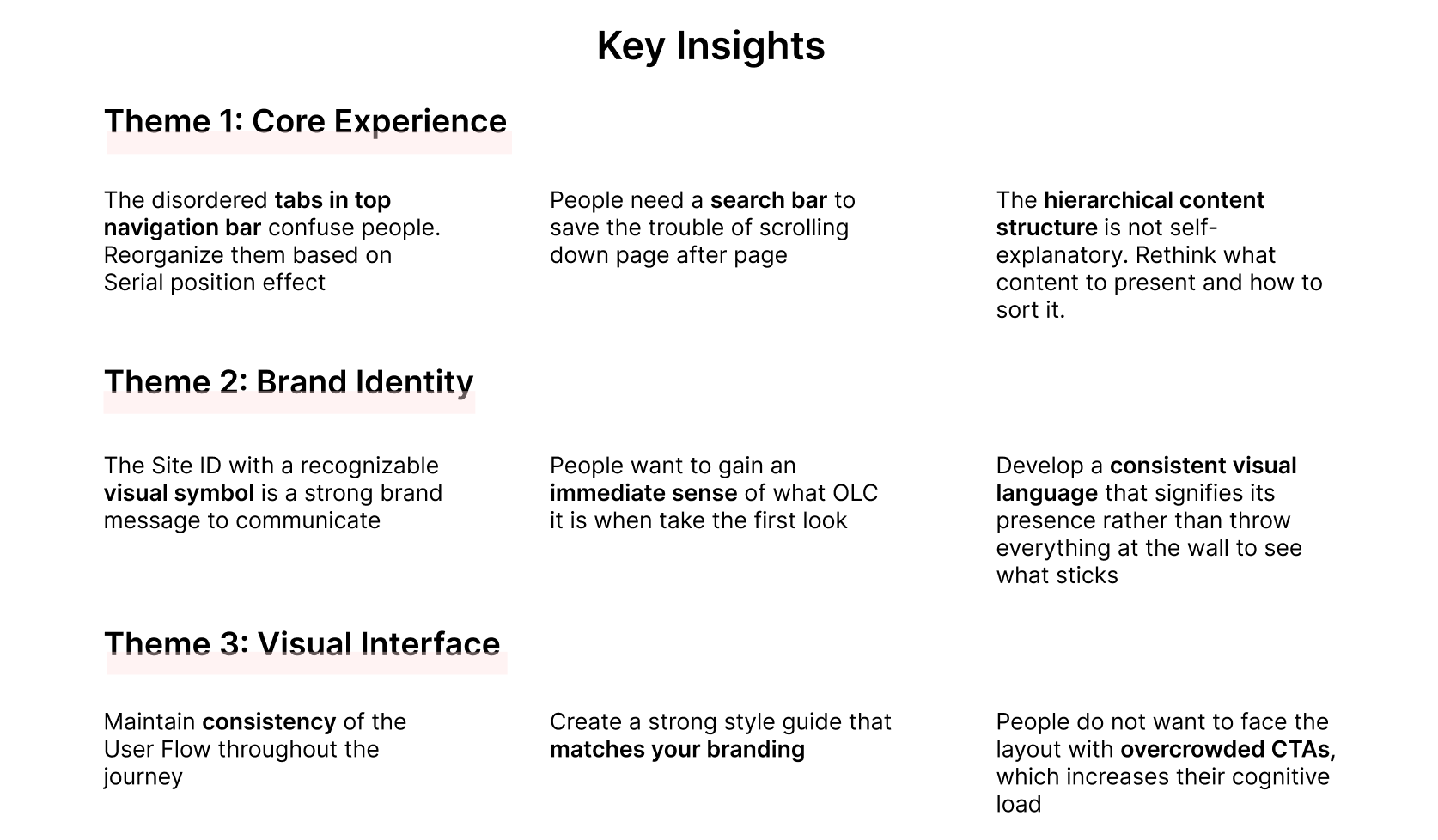
The website needs to speak its identity loudly and efficiently by improving the user experience
After surfacing several key issues common amongst respondents, we generated the following insights:
PERSONAs
Understand the world from their point of view to inform our point of view
Based on our insights and findings from user interviews, we create three user personas to put face on OLCC’s major audiences - clients, therapists and supporters - and visualize various aspects of their behavior and motivations.
Clients: Seek to find right therapists to accept counseling for their mental health or their families’.
Therapists: Look for training/employment opportunities to provide therapeutic services for people seeking help.
Supporters: Desire to donate money or sponsor this non-profit.
JOURNEY MAPs
Map out their journey to truly feel what they feel in usage contexts
Building personas enables us to meet three user groups from completely different backgrounds than we are. We were empathetic of their current journeys by understanding the real pain points they encountered, thus finding areas to improve upon. There’s so much to be done and that’s exciting!
ON TO THE REDESIGN
Draft initial sketches to halve the problem by visualizing it
Once we organized all our research and defined redesign as an opportunity to improve the experience , we began to explore potential designs for the homepage. Sketching can help translate our thoughts into tangible ideas and better visualize blemishes we try to touch up. This allowed us to explore several concepts for the website layout as illustrated by the quick sketches below.
Initial sketches of the homepage redesign
Wireframe the website before getting to real pixels
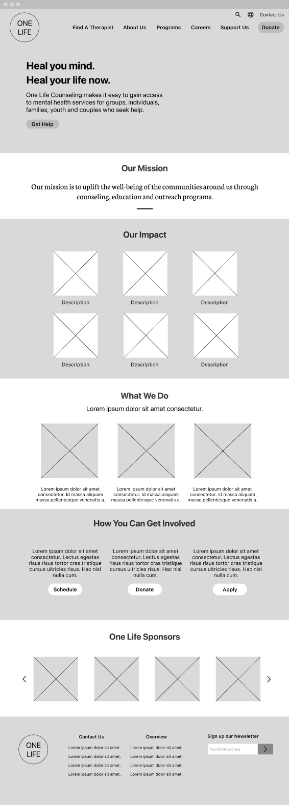
After we defined the core functionalities that we needed to include in our solution, we created quick, low-fidelity, wireframes. This visual guide helped me arrange the interface elements while we focused on the functionality rather than appearance.
TESTING + IMPROVEMENTS
Three major improvements on the way
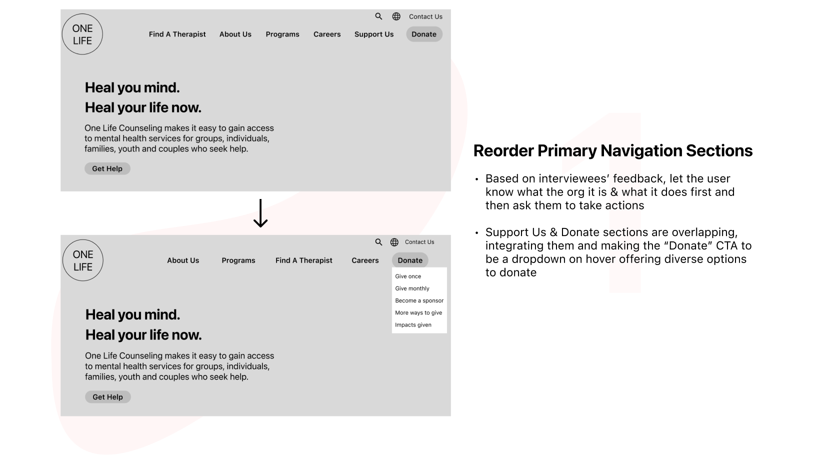
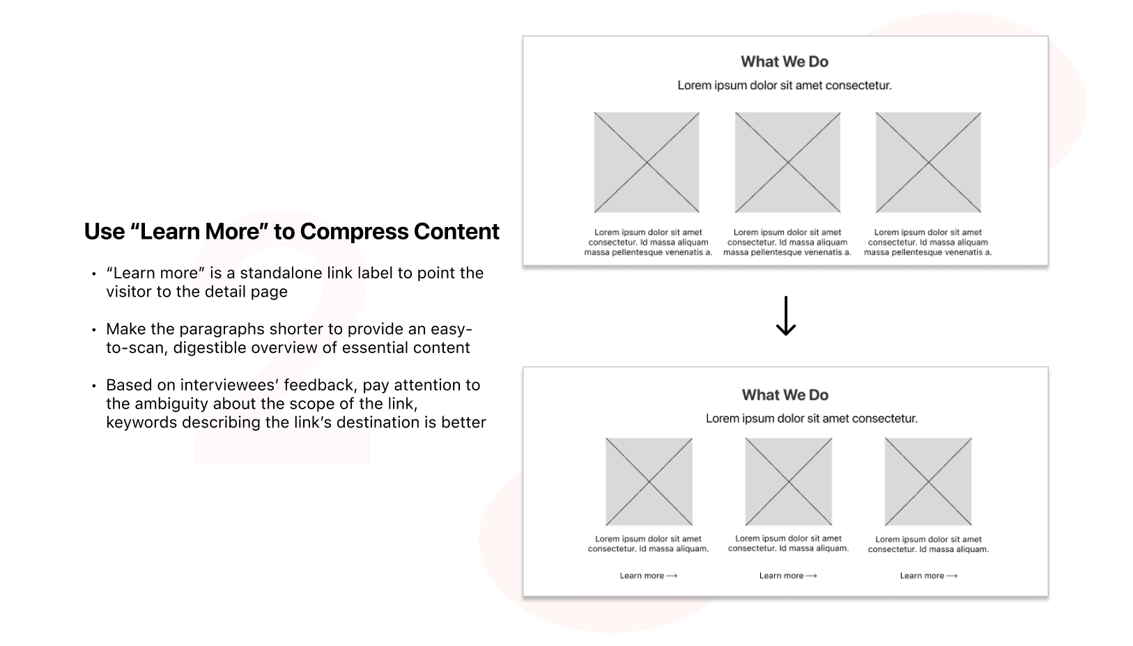
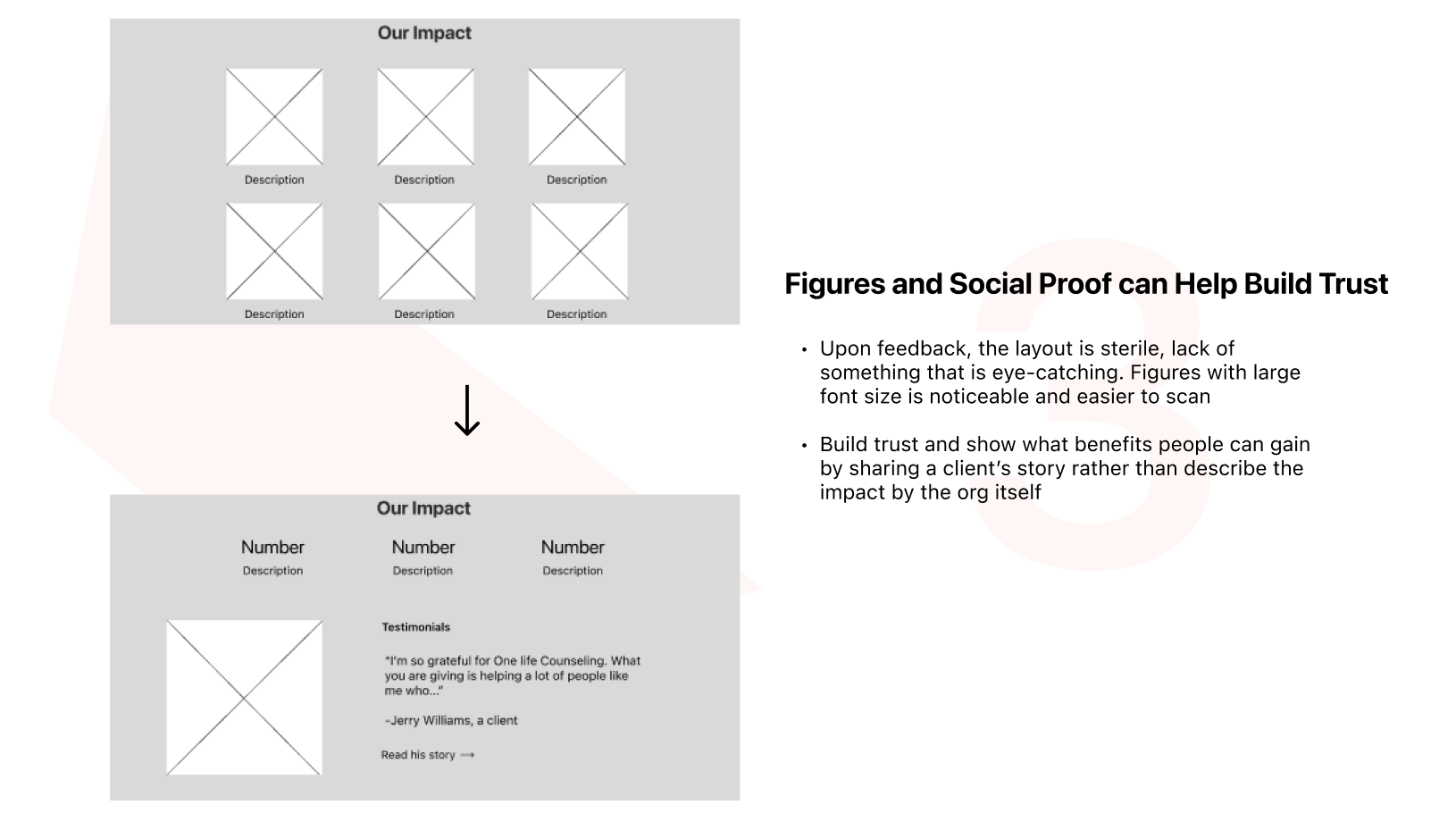
Using these wireframes, we conduct user interviews again with 4 interviewees. This enabled us to gather some crucial feedback to help us decide what to include in the final experience and continually iterate our design. There were three key improvements we made:
UX SUGGESTIONS & REDESIGN
Experience#1: Top Navigation
Currently, the hero background covers the top navigation menu. To make the navigation bar more visible with sharp contrast, I separated it from the hero image. Since the primary navigation sections are messy and disorganized so I recategorized and reordered them to make people easier to understand what the organization it is and then take actions to get involved. I also utilized utility navigation at the top right corner to help users use the site. For brand recognition, I added the logo (designed by OLCC themselves) at the left corner to make a strong first impression.
Before vs After: Top Navigation
Experience#2: Hero Section
The current site has an eye-catching hero image conveying love and caring. However, the unclear hero message, “Welcome to your next chapter”, failed to tell people what OLCC it is and what products or services it offer. Therefore, I changed the hero texts using bright pink font color to enable visitors to have an immediate sense of what it is. Besides, two buttons below the message with two languages may confuse people and they have no idea what these buttons do. Left one button for the primary action - finding a therapist.
Before vs After: Hero Section
Experience#3: Body Content - Community Impact
The story of community impact is not strong enough to illustrate what impacts OLCC has already made. To build more trust, I added a personal testimonial from people impacted by OLCC. Also, the color of this part is not consistent with the primary color palette, bright pink. Color consistency helps with being recognizable and memorable.
Before vs After: Community Impact
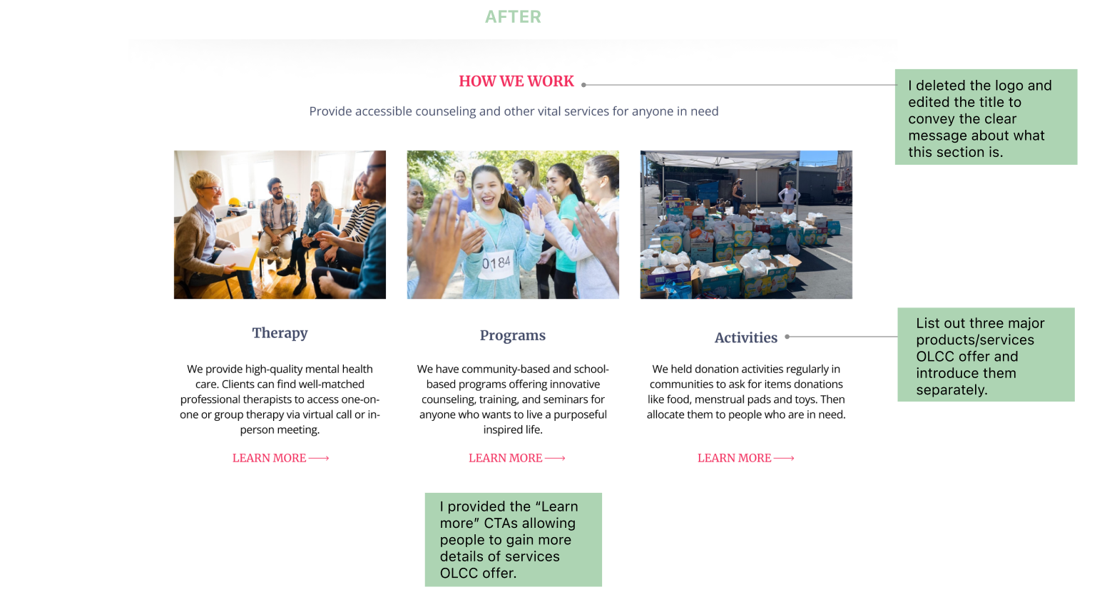
Experience#4: Body Content - How We Work
Without a header narrating what this section it is, users have no idea whether this section include the information they want to gain and how much attention they should pay on it. Also, users are not empowered to open in separate pages to gain more details of these three services OLCC offer.
Before vs After: How We Work
THE FINAL SCREEN
The final product
VALIDATION TESTING
To validate the changes we made, I surveyed the previous 10 participants again with our prototype. We asked the same questions from our initial tests and recorded their behavior and feedback.
Results from validation testing
As a result of the redesign, the success rate for tasks increases 90% and 60%, respectively.
Here’s what people said about the redesign
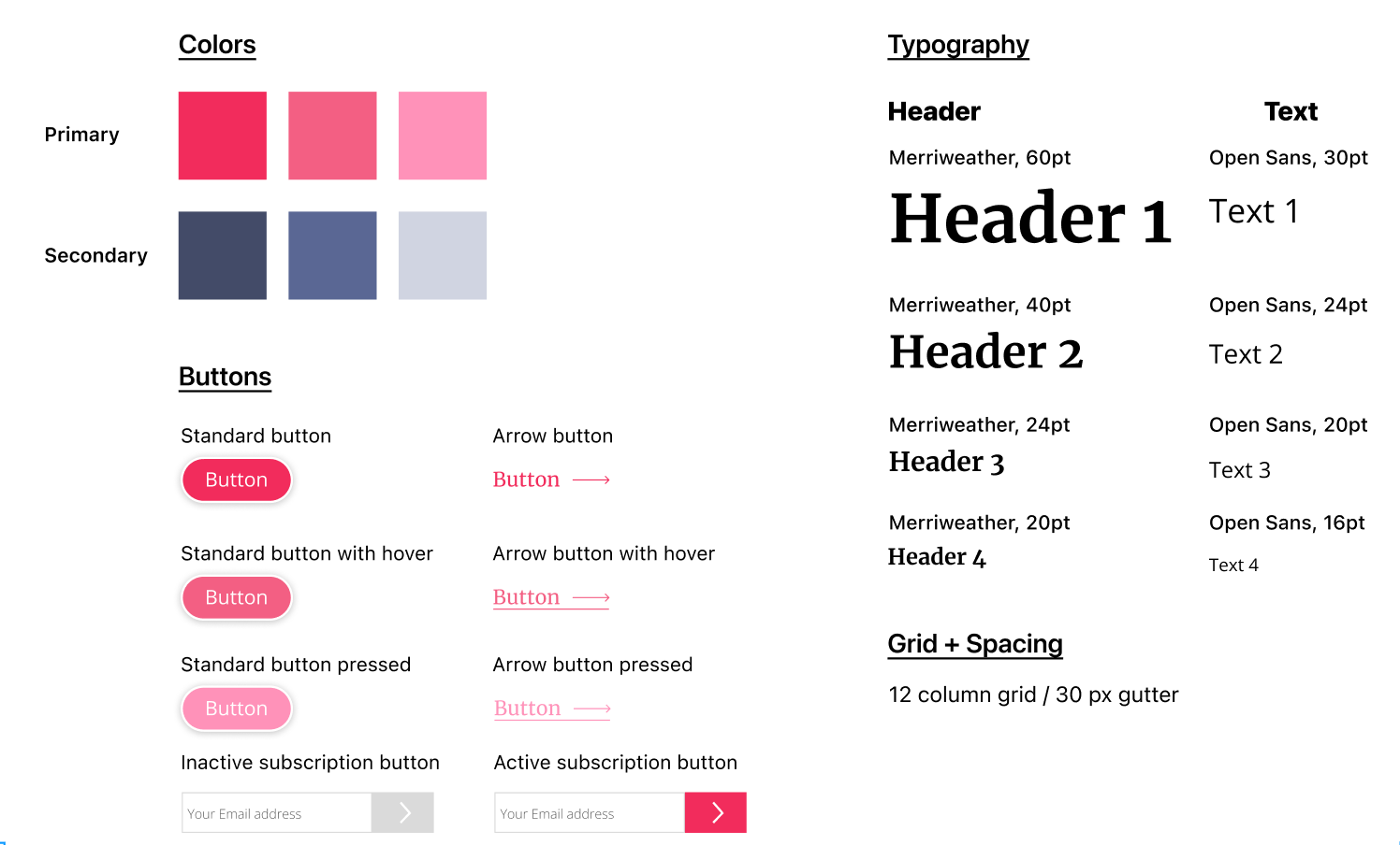
The Style Guideline
Link to my full Figma work file here.
REFLECTIONS ON MY WORK HERE
A challenging but rewarding journey
I was both excited and nervous about this project — excited because I was driven by a passion to do design work for a cause that matters and in the belief people should design for good, and nervous because I’ve never designed a website for non-profits before, a closed book to me. What I needed at first was a deep breath. And out. However, there was no doubt that it was the perfect opportunity to hone my design and thinking skills by making my way through the messy design process. I’ve learned a few things in this UX journey:
How we give is more important than how much we give. It is the layout allocation and the content structure that determine how long visitors browse the site and where they stop. The messy structure without clear content hierarchy as well as logical information sequence will come into conflict with visitors’ mental model and hinder them from achieving their own goals, thus worsening the whole user experience.
Embrace more back and forth during the design process. It seems that as with any UX project, there is much more back and forth than you might originally anticipate. I got a better sense through this project about how to think out solutions from the user experience perspective and the visual experience. If I could go back and change anything it would be deciding to take the project on right now when there were a lot of other priorities I had to focus on.
The research stage is truly an indispensable part of the journey. Doing research is a must-do for segmenting audiences. Users can also tell us which direction our product should go and what we are missing. Only after in-depth interviews did I understand what was important to users and how to make this redesign truly valuable for them. By skipping the research phase, one could end up with a product that no one needs.
Intentionality is everything. For someone coming from a product background, this may sound like a truism. Yet for someone without this type of background, this principle can easily be overlooked. They might want to share all the things at the same time, in the process drowning even the most powerful message in the noise. That’s why OLCC needs to better the user experience.
What we need to do next is to redesign pages other than the homepage. Other pages need to be redesigned further to smooth the user flow based on the navigation structure built on the homepage.
Thanks for reading my case study! 😊
You may also like…
Let’s connect!
© 2023 — Designed by Ningtao Jiang

