Project Context
April - May 2022 (8 weeks)
Student team project
Team Member: Doris Torres, Amie Guidry, Nara Vajaphattana; Mentor: Jason Levine
My Role
User Research: User interviews, Persona, User Journey Mapping
UI Design
PROBLEM
It’s hard for college students to purchase a touchscreen laptop on the desktop website
College students are one of the priority customers of Dell’s laptop market. Yet, we team found that the Dell website has certain issues in discoverability, usability and customer value. This sparked the question - why did students have difficulties in locating touchscreen laptops and complete the checkout flow successfully?
THE SOLUTION
Improving easy-of-use is key
Research
Heuristic Evaluation can help define its usability
In our heuristic evaluation research, we looked into three aspects: situational awareness, supporting mental models, and supporting user goals to assess the Dell’s website. We discovered that these issues occurred on the Dell’s website, too many items in the primary navigation, lack of consistency of breadcrumbs usage, cluttered product page, and unnecessary purchasing steps, etc.
Link to the entire HE report here.
User Testing
Above 80% participants were not confident in buying laptops on the Dell’s website
We conducted user testings with 12 participants (college students), followed and observed how they complete our usability tasks while interacting with the Dell’s website. The major usability tasks are as follows:
Find touchscreen laptops
Select laptops that is less than 15 inches wide, has at least 500 GB of storage size, and is less than $1500
Compare three laptops at the same time and add one of them to your cart
Locate "Student Discount"
Purchase extended warranties and additional software
proceed to checkout items
Key Performance Indicators (KPIs) in User Testings
Results from User Testings
Key Quotes Directly from Users
THE MAIN INSIGHTs
Participants struggled with the issues of LACK of discoverability and easy of use
After conducting the heuristic evaluation and pulling together all data collected from user testings, we arrived at the following key insights, which encapsulated the major challenges that college students face in the user flow, pushing forwards calls to solutions.
PERSONA & EMPATHY MAP
Visualize what people really think and feel about the product
Based on our insights and observations from user testings, we created the college student persona which gave us a clear picture of the users’ backgrounds, values and expectations. We also mapped the response and thought of the user to understand their demands and frustrations.
JOURNEY MAP
Identify the main plot-points in our scenarios
The persona and empathy map helped us discern sufficient behavioral variables to segment our user audience. Then we crafted a user journey map enabling us to communicate the severity of the pain points and facilitate conversations about the areas we want to fix.
DESIGN
Accept the ambiguity: Being more wrong to being less wrong
How might we make the navigation easy-of-use and simplify the purchase process?
We team pursued the redesign as an opportunity to improve the user experience. From the outset, we felt overwhelmed by flaws identified in our researches. While we’d love to be able to resolve all of the issues that users may encounter, we don’t believe that is feasible given the time constraints. Finally, we decided to focus on three redesign ideas that could tackle the major problem space.
IMPROVEMENTS
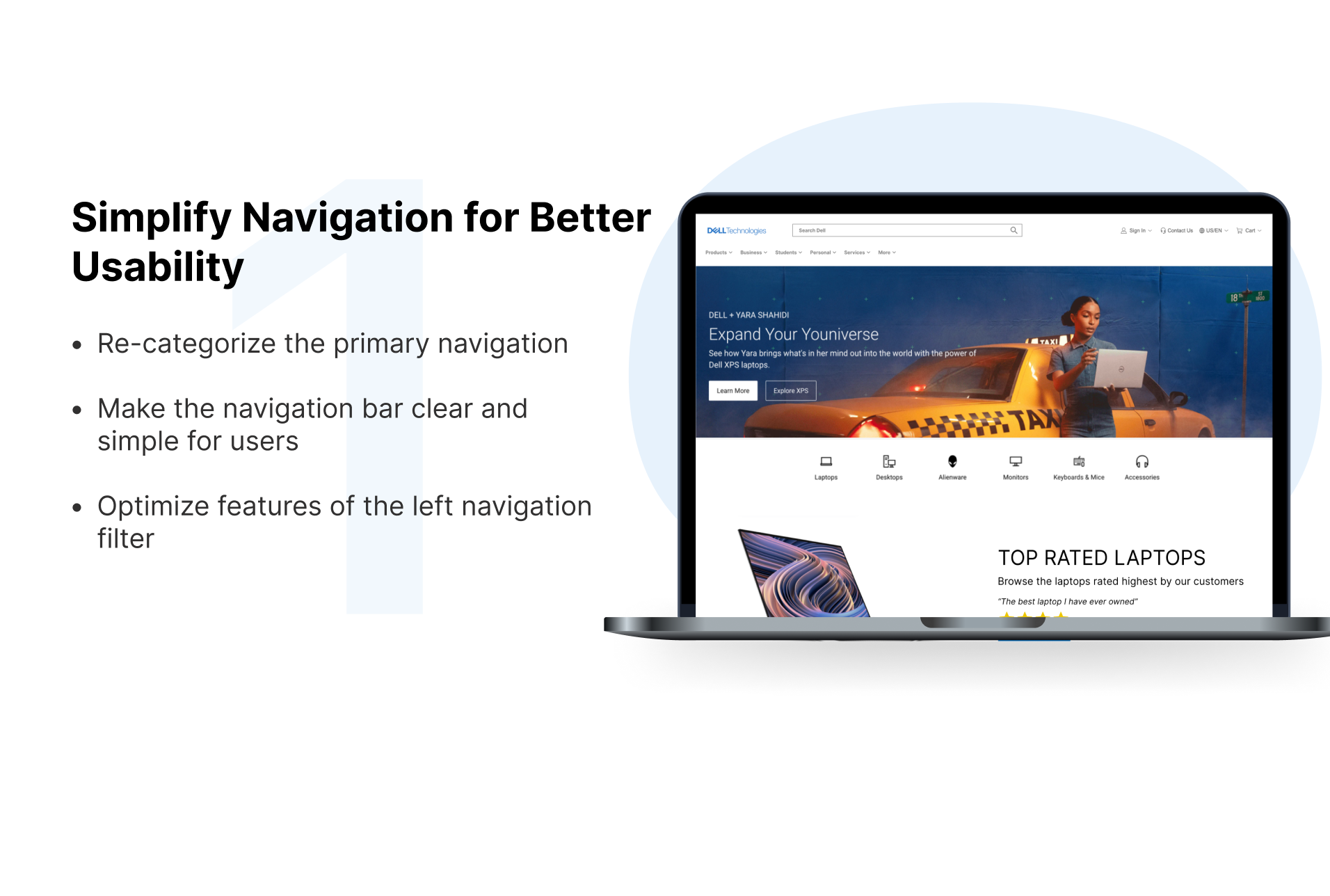
Three major improvements in our design
Based on various feedback from 6 peers and our mentor, we continuously iterated our design over the span of three weeks - with three major improvements:
Link to my full Figma work file here.
REFELCTION + CONCLUSION
Things I’ll do differently next time
This was my first-ever UX project🎉!I really appreciate going through an entire UX process with my amazing team members and my mentor. I can’t agree with what Steve Job said anymore: “Design is not just what it looks and feels like. Design is how it works.” There are a few things I’ve learned in this UX journey:
Form the habit of truly seeing the problems from users' perspectives. This was my first time to conduct user testings and interviews. To be honest, it was hard to stay neutral and not influence the participants while doing testings. Specifically, I couldn’t resist my temptation to tell them what to do when they are struggling in tasks. It hided the problems users want to uncover.
Focus on feasibility, desirability and viability while evaluating ideas. When ideating solutions, keep the mindset that there is no bad ideas and brainstorm as many ideas as possible. While evaluating ideas with my team, however, there were three standards we should comply with, or else, we had difficulties in determining which ideas we should value and focus on. We team spent a little bit longer time deciding our major final solutions.
Collect and analyze user feedback early on. I’m thankful to have constantly asked for feedback from my peers and my mentor. Because of limited time, we team can’t collect feedback from users towards our solutions we put forward. If we can get feedback early on, we can improve our ideas as much as we can.
Love what I do and never lose my passion. Be burning with a problem or a wrong that I want to right. Sometimes the journey for problem-solving is going to hit me in the head with a brick. Keep going, thinking and learning! Most importantly, always trust my intuition and don’t be afraid to tweak my design here and there.
Thanks for reading my case study! 😊
You may also like…
Let’s connect!
© 2023 — Designed by Ningtao Jiang


